6.1 KiB
Bootstrap
Bootstrap is a modern CSS framework for building web sites with a responsive grid layout and a consistent, modern style
Originally developed by Twitter for encouraging consistency in web UI design
Nowadays handled by a separate team
Very common in modern websites
https://getbootstrap.com/docs/
Basic idea of Bootstrap
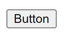
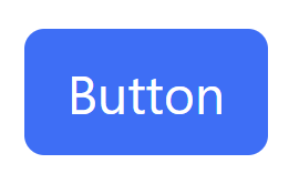
When developing a web page with Bootstrap you rarely need to write your own CSS. With Bootstrap we can use pre-made classes that will style the components for us. For example:
Non-styled button
Button with Bootstrap styling
Button
Button
Bootstrap Grid
The web page consist of rows
Each row is divided into a specific number of columns (max 12)
Each element can take an arbitrary number of columns
The sizes of elements and the number of columns in a row can be easily specified with CSS classes that Bootstrap has pre-defined
https://getbootstrap.com/docs/5.3/layout/grid/
In most cases all content in Bootstrap should be wrapped inside a
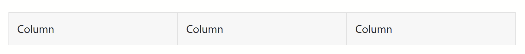
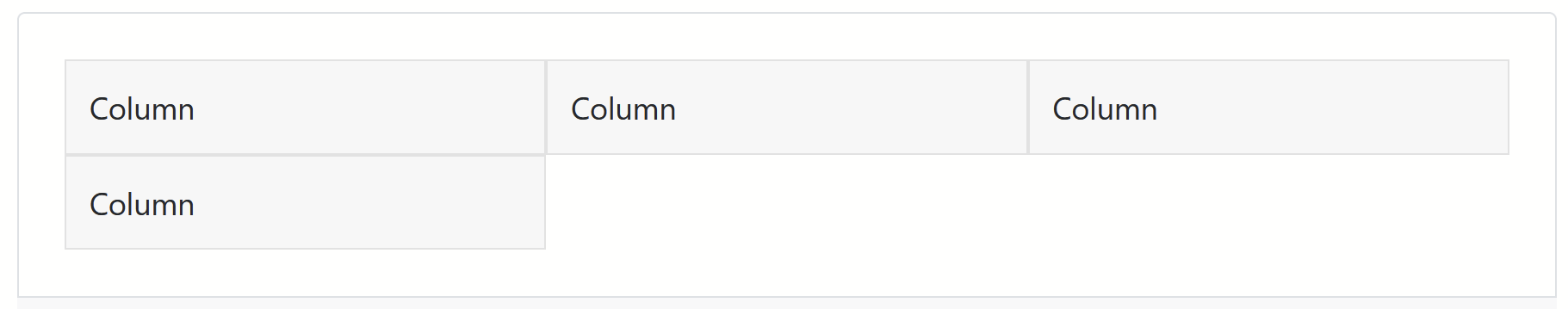
Bootstrap grid: basic example
Centered row with 3 columns
Column
Column
Column
Bootstrap: column count in row
- You can specify a row element to have a specific number of columns with the row-cols- class
- For example, row-cols-2 for 2 columns in a row
- Here's a row-cols-3 example: a row with 3 columns
- It has 4 inner elements each spanning a column,
- 4 > 3, so the last element wraps to create a new row
Bootstrap: element width
You can make an element span many columns with the col- class
E.g., an element with the col-6 class takes up 6 columns
1 of 3
2 of 3 (wider)
3 of 3

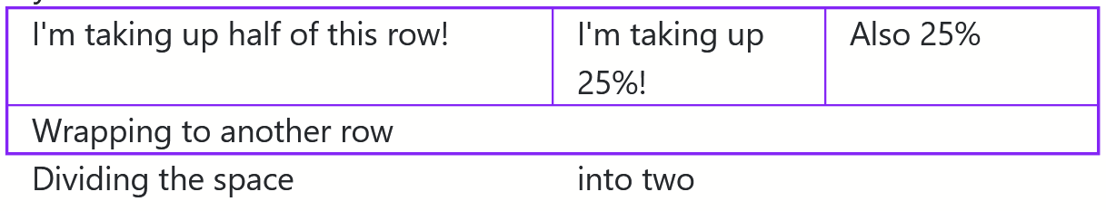
Exercise 1: Layout with Bootstrap
Create a new HTML document and add Bootstrap CSS to it.
Using Bootstrap, re-create the layout below. You don't need to add the purple border lines between the elements, they can be regular
Extra: make the columns stack on small browser windows
Bootstrap: spacing
One particularly useful feature of Bootstrap is readily provided CSS classes for spacing!
For example, to add padding around an element, we can just give it a p-x class, where x is a number from 1 to 5 depending on how much padding we want.
https://getbootstrap.com/docs/5.3/utilities/spacing/
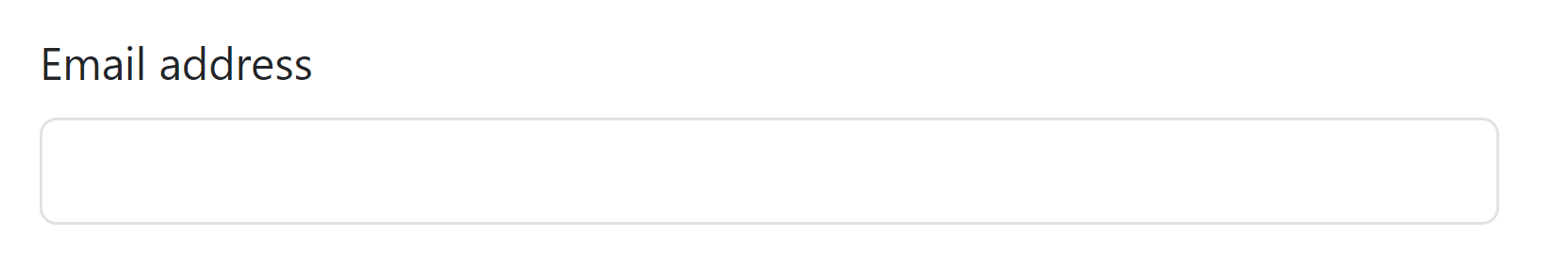
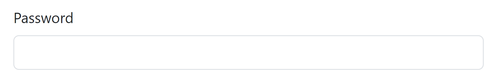
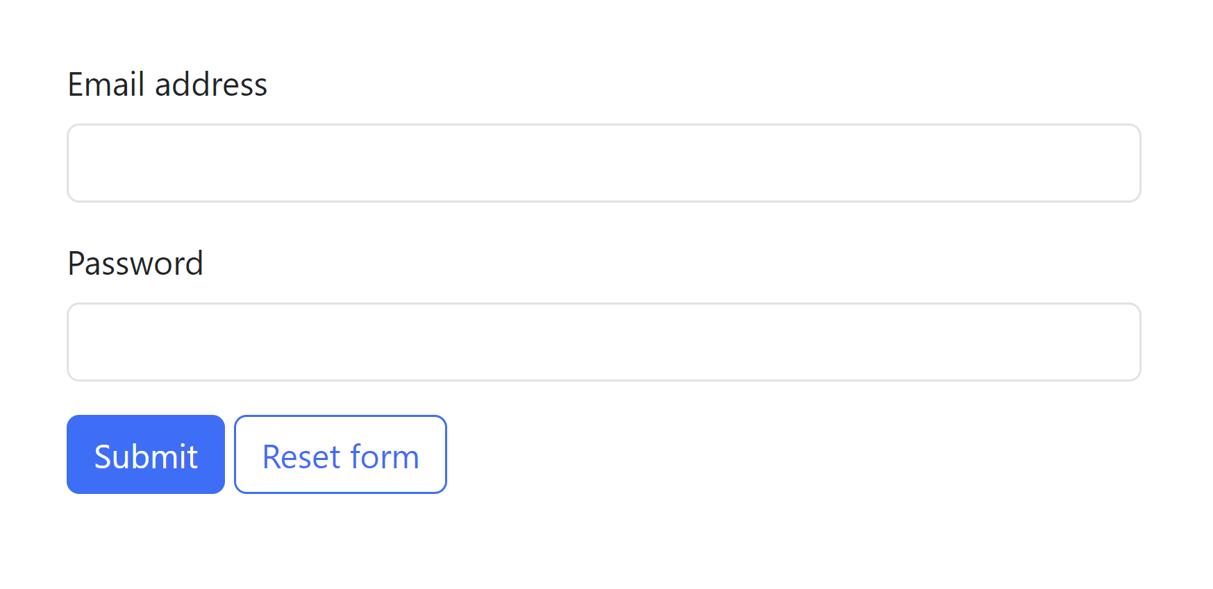
Bootstrap input form
Bootstrap includes styled input forms and buttons that look much better than the default ones.

Code for the form in the previous slide
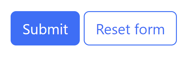
Submit
Reset form
Submit
Reset form
Styling forms
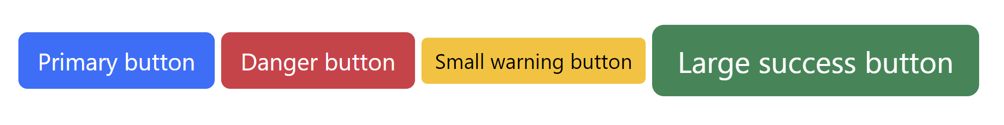
Input field size, button size, button color etc. can be changed just by adding classes to the element. For example:
Primary button
Danger button
Small warning button
Large success button
Exercise 2: Input form
Create the form from earlier
Add a checkbox
Add radio buttons
Make the input fields LARGE
Change the colors of the buttons and make them full width and stacked on top of each other
Use spacing classes like mb-2, pb-2 etc. to space the elements to your liking
Bootstrap: advanced
Bootstrap also offers many additional useful features
Standardized color classes
R __esponsive __ CSS classes to make the web site usable on both smaller and larger screens
Classes for setting element alignment (vertical-align)
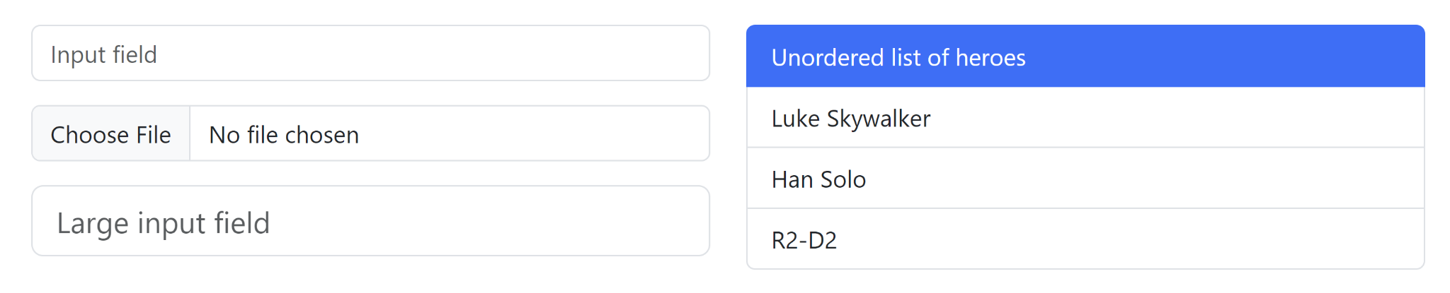
Styles for various different elements, like buttons, forms and lists
Bootstrap: conclusion
Bootstrap provides a CSS layout system and a lot of ready-made CSS classes
Helps you to create appealing web pages quickly, without needing to write a lot of boilerplate CSS code
Look up Bootstrap's documentation if you're wondering whether it could save time in, e.g., styling your button or table
https://getbootstrap.com/docs/5.3/getting-started/introduction/