Note!
Another note!
CSS.note { font-size: 3em; } Classes and IDs: hierarchy * What if a HTML element is styled using multiple overlapping definitions? ** the rules declared later override the ones declared earlier * If an element has an id and a class, the rules in the id override their counterparts from the class * It's possible to manually override rules with the !important keyword * It's best to avoid it, though * It can be VERY easily overused! * It's usually best to avoid _multiple definitions_ as well to keep things simple. # Styling elements Color & style: Background color Let's make the div have a __ background-color __ so we can see where it is! div { _background-color_ : _darkgray_ ; } We can also color our paragraphs and h1 elements and set their fonts p { _font-size_ : 18px; _font-family_ : Verdana; _color_ : white; } Do the same for h1 Color & style: Hex values * Color names like _red _ and _yellow_ produce harsh primary colors * You want to use _hex values_ instead * for example #00688b or #f4858e * Hex color consists of 3 hexadecimal numbers from 00 to ff (0 to 255 in decimal!) * First hex number corresponds to red, second to green, and third to blue. For example, #ff0000 results in pure bright red * VSCode shows the color of the corresponding hex value! * There are websites to convert color values to hex * Try to google search "hex color picker" Let's learn the basic rules to manage the _size _ of something div { _width_ : 200px; _height_ : 250px; } img { _width_ : 100%; } We have width and height we can adjust px means pixels % is the percentage of the parent's (in this case div's) width px and % are not the only [units of measurement](https://www.w3schools.com/cssref/css_units.php) in CSS even if they are the most common. em and rem are also widely used, among others. Margin and padding * _Margin _ and _padding _ define the space _around _ and _inside _ the element, respectively * You can also use _-top_ , _-bottom_ , _-left_ and _-right_ to set values to individual sides * _margin _ or _padding_ alone set a shared value for every side * div { * _padding_ : 30px; * _margin_ : auto; * _margin-top_ : 100px; * } * h1 { * _margin-bottom_ : 0px; * } * p { * _margin-top_ : 5px; * } * img { * _width_ : 100%; * } * One special case is margin: auto; which centers the element 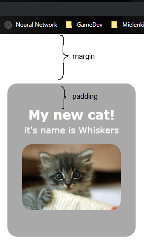 Margin, _border, _ and padding Additionally, there's _border_ __, __ which defines how thick the element's border is! This is how margin, border and padding stack up → 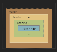 --- Näytä dev tools chromesta # Text-align Text can be aligned with the _text-align_ rule. In addition to text, it effects to all [inline](https://www.w3schools.com/html/html_blocks.asp) or [inline-block](https://www.w3schools.com/css/css_inline-block.asp) elements. 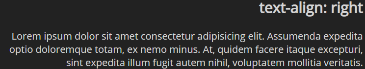 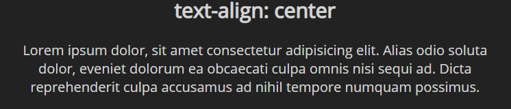 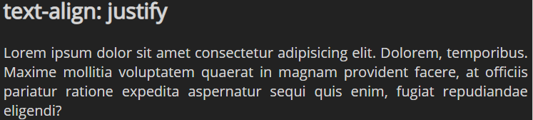 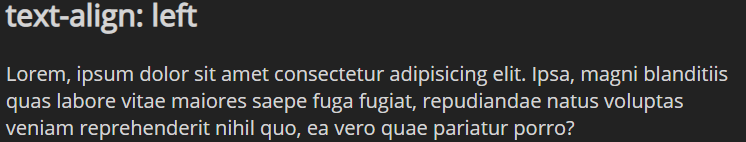 div { ... _text-align_ : center; } Let's center our content inside div: Giving some border-radius rounds the corners nicely _border-radius_ : 20px; # Exercise 1: IDs and classes Modifying the page that we previously created in "Web Basics and HTML", create a style sheet named style.css and link it to the page. Then add the following features: Create a
element) inside of it. Give the div a class that gives it a yellow background color. Create another
- and
- elements
- First item
- Second item
- ) element with at least 5
- items to your page.
Then, in your style.css, add a CSS style that changes the text color of every odd-number-indexed list element to purple.
Tip: nth-child allows specifying odd instead of even for styling odd-indexed children
# Layouts
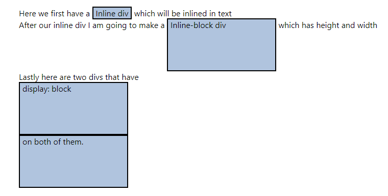
* Display defines how an element is visible on the screen
* Here we have examples of _inline_ , _inline-block_ and _block_
* There is also _none_ __ __ which makes an element invisible
* Often used to hide elements with JS
A [flexbox](https://developer.mozilla.org/en-US/docs/Web/CSS/CSS_Flexible_Box_Layout/Basic_Concepts_of_Flexbox) is used to flexibly align elements in either a vertical or a horizontal manner
It is a reasonably "modern" way to position elements
[https://css-tricks.com/snippets/css/a-guide-to-flexbox/](https://css-tricks.com/snippets/css/a-guide-to-flexbox/)
# Flexbox example
Suppose we have the following code
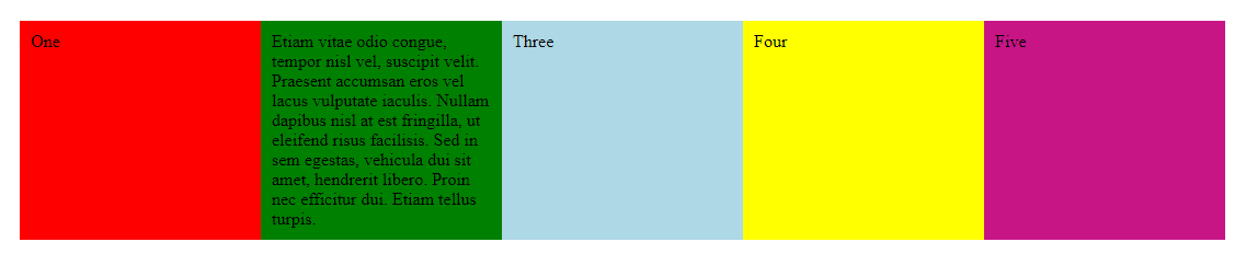
Notice by how only defining the _wrapper_ _ _ with _display_ : flex, the sub elements become "flex elements"!
.wrapper {
_display_ : flex;
_flex-direction_ : row;
_flex-wrap_ : wrap;
}
.wrapper div {
_width: 200px;_
}
 # Exercise 4: Flexbox Modifying the same page that we've created, add a flexbox (flex container). To the container, add 5 div items with text content. First, align the flex items vertically. Modify the CSS to align the items horizontally. Modify the CSS to allow the content to wrap to multiple lines. Test that it works properly by making the content too wide for a single line. A [grid](https://developer.mozilla.org/en-US/docs/Web/CSS/CSS_Grid_Layout/Basic_Concepts_of_Grid_Layout) layout is used to align elements to a gridOneEtiam...ThreeFourFive.wrapper { _display_ : grid; _grid-template-columns_ : 1fr 1fr 3fr; _grid-auto-rows_ : 200px; } 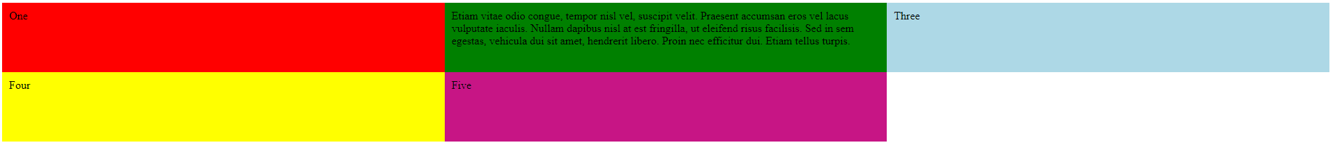 # Exercise 5: Grid Create the following grid structure with the grid layout: 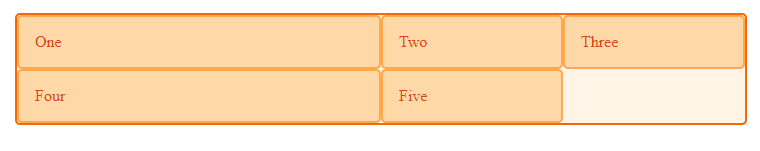 # Responsiveness In the early days of web development everything was done (or at least attempted to be done) pixel perfect. To achieve this, elements had absolute positions and sizes etc. This means that the web page would look the same on every screen size. This is not advisable any more since people use so many different sizes and orientations of screens. To solve the problem of different screen sizes, web developers first started to make different versions of websites for different resolutions and orientations. For example there might have been a "mobile version" of a site. This is also an outdated way of developing web pages. The best way to combat this problem is _ responsiveness. _ This means that the contents of a web page will neatly scale on any screen size and orientation.   Responsiveness is achieved by using relative sizes, margins and positions, for example: Percentage based values Units like em and rem Breakpoints for viewport size to force different sizes and positions depending on the screen size. Developing responsive web pages from scratch is time consuming. Luckily there are frameworks to help us with that. One such framework is called Bootstrap and we will take a look at it in the next section. * It's absolutely impossible to remember all the HTML and CSS stuff on the top of your head. * Websites like [Mozilla's developer page](https://developer.mozilla.org/en-US/docs/Web/HTML/Element) or _www.w3schools.com_ help here! * The most important thing about learning HTML and CSS is to know _what _ exists and _where _ to find them. Shortly, you'll become faster and have a better idea on what you need * If you find something on a website you like but don't know how to implement it, open the _ _ _developer tools_ to see how they did it! (More on that next time!) # Assignments [Assignments about this topic can be found here](https://gitea.buutti.com/education/academy-assignments/src/branch/master/Front-end%20Basics/2.%20CSS)OneEtiam...ThreeFourFive